Common configuration options for all slices
Warning
This help isn’t complete. It may even look terrible. If you want to work on it, see How to Contribute. You can also ask for help in the Juice Slack #documentation channel.
Contents
Common slice configuration
These options appear at the top level of the slice.
slice_type
The kind of slice to display.
| Optional: | no |
|---|---|
| Values: | A valid slice type string. |
| Example: | slice_type: 'card'
config:
...
|
title
A template that appears at the top of the slice.
| Optional: | yes |
|---|---|
| Values: | Underscore.js template |
| Example: | title: "What is the <%= lollipop.selectionDisplay() %> by <%= lollipop.metadata(lollipop.selectionType(), 'plural') %>?"
config:
...
|
subtitle
A template that appears below the title of the slice. It will only show up on slices that use any of the two-column layouts.
| Optional: | yes |
|---|---|
| Values: | Underscore.js template |
| Example: | subtitle: "I am a subtitle. My selection is <%= lollipop.selectionDisplay() %>"
config:
...
|
layout
Different layout settings change the organization, sizing, and placement of slice components.
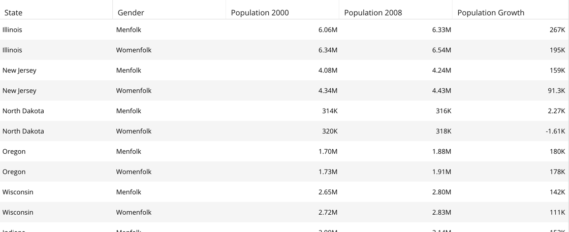
default: This is the standard layout where the visualization content takes
the full width of the slice. The slice title header is on top, with component
locations above and below the vis.
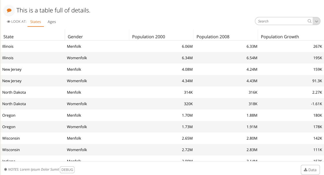
bare: This removes all components except the visualization.
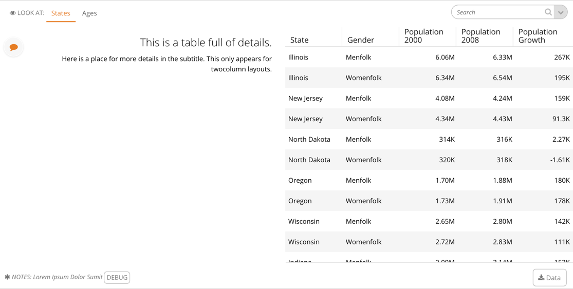
twocolumns: When using a two column layout, the slice title, discussions
button, filter pill, and subtitle are all placed to the left of the visualization.
This layout is good when you would like to use more text to describe what the user is seeing.
The subtitle component is available in this layout, and sits below the title
and above the filter pill.
Note
Depending on the slice type, the components may have different default layout locations to best support the reading and use of the visualization. Also, some slices may scroll horizontally to see the full visualization.
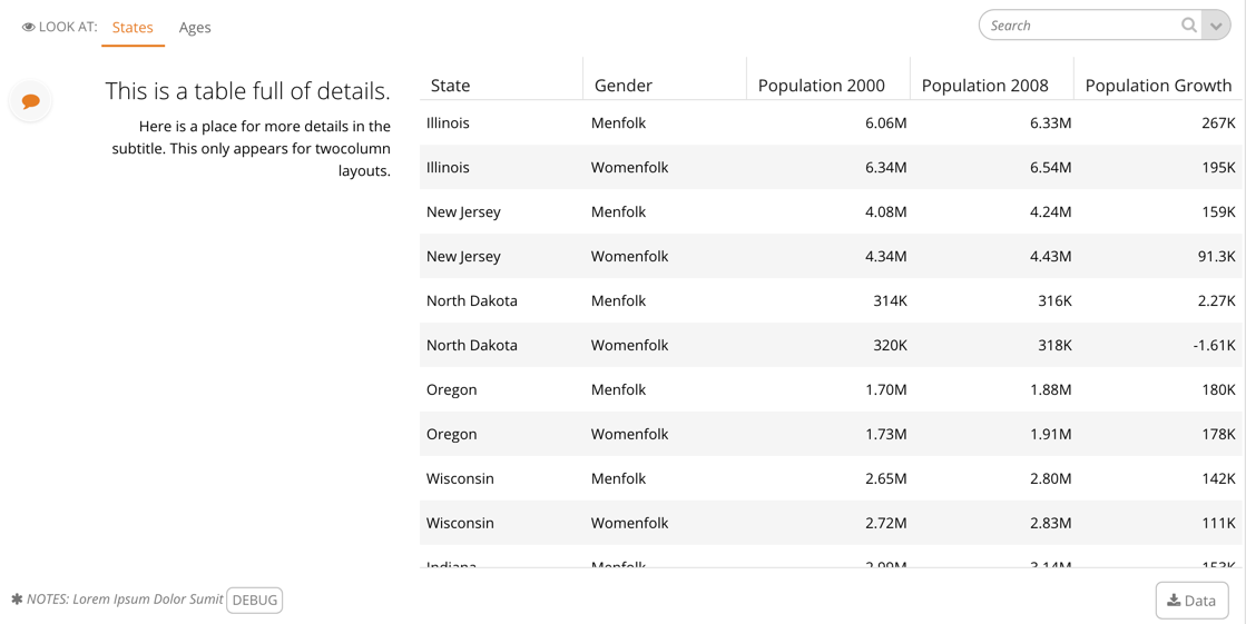
twocolumns-twothirds: This two column variation makes the left side one third and the right visualization side
into two thirds.
| Optional: | yes |
|---|---|
| Values: | default, bare, twocolumns, twocolumns-twothirds |
| Example: | layout: twocolumns
config:
...
|
path
The name of the path this slice should be active at. If nothing is specified, the slice will be available/visible at all times. Any slice can define a path through its selection and it will affect all the slices underneath it (think of it like a filter selection, but it will show/hide the slice instead of filtering the slice.
| Optional: | yes, default is |
|---|---|
| Values: | an array of string paths. For consistency, you should start all
your path names with |
| Example: | config:
path:
- path-sales
- path-users
# or
config:
path: 'path-sales'
|
bare
Should only the visualization part of the slice be rendered.
| Optional: | yes, default is false |
|---|---|
| Values: | boolean, true or false |
| Example: | bare: true
|
display_slice_as
Determines how the slice displays in relation to the pill. The viz
option prevents the pill from showing up in the slice but still
allows the pill to show up in the filter bar at the top of the story.
The pill option hides the slice visualization from being displayed,
and only shows the pill as if it were the entire slice. This behavior
can be beneficial for having functionality similar to the option-chooser
slice but with a more compact design. Unlike the pill’s standard
behavior, this pill displays even when there is no selection made,
substituting the selection for a summary of the slice’s options.
The default option displays the slice in its default state -
with its visualization and pill, which is the same as not
setting display_slice_as at all.
Setting display_slice_as to hidden will fetch data but hide the slice entirely.
This allows the slice to be used for selection in an embedFilterPill.
Enables Slice Side Panel usage.
| Optional: | yes, default is |
|---|---|
| Values: |
|
| Example: | config:
display_slice_as: pill
|
data_service
The package and classname that defines your data service. Alternately, a json
file containing valid juicebox response data located in the stack’s
fixtures/ directory. If a fixtures/ directory is not present,
create it.
If the data_service property is missing for a slice, an empty response will
be generated and the WithNoData mixin will be applied. data_service
should only be omitted for free-form slices.
| Optional: | yes, default is false |
|---|---|
| Values: | string, either a |
| Example: | data_service: basicservice.RankedListService
|
or
data_service: distribution.json
include_commands
What commands should be included on this slice. Commands allow users to perform actions using the data on the slice. There are several built-in
| Optional: | yes, default is no commands |
|---|---|
| Values: | a list of command names |
| Example: | include_commands:
- "download-data"
- "download-image"
|
To create custom app commands and learn more about built-in commands, see Writing app commands
Common slice config options
Note
These options appear within the config object.
noSelectionTextTemplate
This allows slices to customize the text that displays in the pill when there are no selections.
| Optional: | Yes, only activated when |
|---|---|
| Values: | The name of the template to render |
| Example: | config:
noSelectionTextTemplate: "template-id-name"
|
layoutFlags
Sets show/hide state for slice widgets (search, etc…).
Note: To show the legend widget, in addition to setting the showLegend flag to true,
you also need to have a non-empty legend object inside templateContext in the response.
| Optional: | Yes, default is config:
layoutFlags:
showCommands: true
showGuide: false
showControls: true
showDatasets: true
showSearch: false
showNotes: true
showLegend: false
|
|---|---|
| Values: | An object with |
| Example: | config:
layoutFlags:
showCommands: false
showGuide: false
showControls: true
showSearch: false
showNotes: true
showLegend: false
|
minSelections
The minimum number of selections allowed in this slice. Any number bigger
than 0 will disable clear selections option in the slice header (local
filters/slice selections).
| Optional: | yes, default is 0 |
|---|---|
| Values: | numbers |
| Example: | config:
minSelections: 1
|
maxSelections
The maximum number of selections allowed in this slice.
| Optional: | yes |
|---|---|
| Values: | integer |
| Example: | config:
maxSelections: 1
|
noDataMessage
A message to display when when no data is retrieved from the server.
| Optional: | yes |
|---|---|
| Values: | text |
| Example: | config:
noDataMessage: "Nothing to see here, try to change your filters."
|
layout
An object that defines the layout of all widgets in the slice. Contains layout locations (eg. top-left) with widget names (eg. controls) in them.
| Optional: | yes |
|---|---|
| Values: | JS Object with in this form: |
| Example: | config:
layout:
"top-left": ["guide","legend","controls", "datasets"]
"top-right": ["search"]
"top-classes": []
"bottom-left": ["notes"]
"bottom-right": ["commands", "drawer"]
"bottom-center": []
"bottom-classes": []
|
baseTemplate
Slice base template name selector.
| Optional: | yes, default is “#base-slice-template” |
|---|---|
| Values: | The id of a template in |
| Example: | config:
baseTemplate: "#base-slice-template"
|
searchTemplate
The template for the slice search box.
| Optional: | yes, default is “#base-slice-search-template” |
|---|---|
| Values: | The id of a template in |
| Example: | config:
searchTemplate: "#base-slice-search-template"
|
downloadTemplate
The template for the download button. THIS OPTION HAS BEEN REMOVED AND IS NO LONGER SUPPORTED
| Optional: | Yes, default is “#base-slice-download-template” |
|---|---|
| Values: | The id of a template in |
| Example: | config:
downloadTemplate: "#base-slice-download-template"
|
notesTemplate
The template for the slice notes.
| Optional: | yes, default is “#base-slice-notes-template” |
|---|---|
| Values: | The id of a template in |
| Example: | config:
notesTemplate: "#base-slice-notes-template"
|
legendTemplate
Slice legend template name selector.
| Optional: | yes, default is “#base-slice-legend-template” |
|---|---|
| Values: | The id of a template in |
| Example: | config:
legendTemplate: "#base-slice-legend-template"
|
datasetsTemplate
The template for the list of slice datasets/responses.
| Optional: | Yes, default is “#base-slice-datasets-template” |
|---|---|
| Values: | The id of a template in |
| Example: | config:
datasetsTemplate: "#base-slice-datasets-template"
|
bodyTemplate
The template for the slice body.
| Optional: | Yes, default is “#base-slice-body-template” |
|---|---|
| Values: | The id of a template in |
| Example: | config:
bodyTemplate: "#base-slice-body-template"
|
drawerContentTemplate
Template name that will be rendered into the drawer container
| Optional: | Yes. If it is not defined, no drawer and drawer button will be rendered. |
|---|---|
| Values: | The id of a template in |
| Example: | config:
drawerContentTemplate: "#drawer-template"
|
controlsTemplate
The template for the slice control buttons.
| Optional: | yes, default is “#base-slice-controls-template” |
|---|---|
| Values: | The id of a template in |
| Example: | config:
controlsTemplate: "#base-slice-controls-template"
|
collapsable
A boolean flag that indicates if a slice is collapsable (would expand/collapse when clicked on the header). By default all slices are collapsable (no need to define collapsed=true). Useful when a slice needs to stay expanded no matter what (collapsable = false).
| Optional: | yes, default is |
|---|---|
| Values: | Boolean (true | false) |
| Example: | config:
collapsable: false
|
notifyOnDataSetChange
A boolean flag that indicates if a slice should notify all the slices below it (that are listening to it) when its data set changes so they can fetch their data.
| Optional: | yes, default is |
|---|---|
| Values: | Boolean (true | false) |
| Example: | config:
notifyOnDataSetChange: true
|
pagination
An object that describes the pagination parameters. Currently the only
parameter that can be set in it is pageSize.
| Optional: | yes |
|---|---|
| Values: | JS Object with in this form: |
| Example: | config:
pagination:
pageSize: 20
|
For more details on how to write recipes to support pagination, see Supporting pagination.