Card Slice
Note
This help should be accurate and comprehensive. If you see anything missing or that needs to be fixed, see How to Contribute or let us know in the Juice Slack #documentation channel.
Contents
A card slice is used to display record details in a searchable sortable way.
Card config
Card slices support the Common configuration options for all slices. Additional options are:
cardTemplateName
The name of the template that will be used to render the content inside the card. Should start with a # and be defined in templates.html.
| Optional: | No. If not specified, an empty string is rendered for the card content. |
|---|---|
| Values: | A CSS selector that exists in templates.html |
| Example: | config:
cardTemplateName: "#card-template"
|
cardWidth
The width in pixels/percentage of the card
| Optional: | Yes. The default is 250px |
|---|---|
| Values: | String or number |
| Example: | config:
cardWidth: '50%'
or
config:
cardWidth: '250px'
|
searchFields
The data attributes to be used for searching.
Warning: If the slice is paginated, you will also need to add search_keys
to pagination config.
Here is config for an unpaginated slice.
| Optional: | Yes. Default is |
|---|---|
| Values: | An array of strings |
| Example: | config:
searchFields: ['label', 'score']
|
For a paginated slice, config would look like the following.
| Optional: | Yes. Default is |
|---|---|
| Values: | An array of strings |
| Example: | config:
searchFields: ['label', 'score']
pagination:
search_keys: ['label', 'score']
pageSize: 200
|
sortFields
The data attributes to be used for sorting, can specify {field, label, sortDirection, default}.
| field: | The field to sort on |
|---|---|
| label: | The displayed name in the sort picker |
| sortDirection: | optional, can be “ascending”, “descending” or “natural”, default is ascending, natural means no-sorting takes place. |
| default: | true|false, should this sort be selected by default. |
| Optional: | Yes. There is no default |
| Values: | An array of objects as described above |
| Example: | config:
sortFields:
- field: "score"
label: "Score"
default: true
sortDirection: "ascending"
- field: "count"
label: "Count"
|
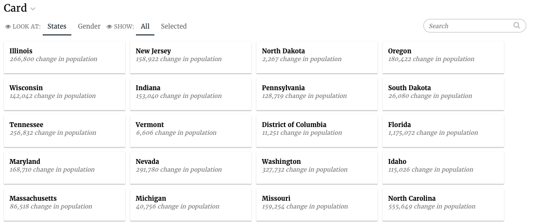
Flavors of Card
Default (card)
The default flavor renders the first supplied dimension as the card label, and returns all the metrics and dimensions by name in the response to be used in the template.
The code for the default card flavor looks as follows:
class CardV3Service2(CensusService):
    def build_response(self):
        self.metrics = ('popdiff',)
        self.dimensions = ('state',)

        recipe1 = self.recipe().metrics(*self.metrics).dimensions(
            *self.dimensions)

        self.response['responses'].append(recipe.render())
The slice in stack.yaml:
- slice_type: "card"
  slug: "jam-card1"
  title: "Card"
  config:
    "cardTemplateName": "#jam-card-template"
  data_service: "censusv2service.CardV3Service2"
And finally the template for the individual cards:
<script type="text/template" id="jam-card-template">
  <div class="fr-body2"><%= datum.label %></div>
  <div class="fr-caption"><%= datum.format("popdiff", ',.0f') %> change in population</div>
</script>
Mixins
CardActionPlannerViewMixin
This is a mixin that is and will only be used by HSTM apps. The data service for the slice that uses this mixin should pass additional context in the response like this:
response['templateContext']['defaultItem'] = {'questions': selected_question,
                                    'title': ' ',
                                    'description': description,
                                    'clientident': ci,
                                    'unitident': ui,
                                    'due_date': datetime.now().date(),
                                    'created_by': self.request.user.get_full_name()}
Linking to websites or files
You can now add and click on hyperlinks in the card slice and it will not interfere with the selection of the card item.
<script type="text/template" id="jam-card-template">
  <div class="fr-body2"><%= datum.label %></div>
  <div class="fr-caption"><%= datum.format("popdiff", ',.0f') %> change in population</div>
  <div class="fr-menu">
    <a href="http://www.juiceanalytics.com" target="_blank">Visit website</a>
  </div>
</script>