Trend
Warning
This help isn’t complete. It may even look terrible. If you want to work on it, see How to Contribute. You can also ask for help in the Juice Slack #documentation channel.
Contents
The trend slice presents data series in a trend line as either bars or lines.
Trend config
Trend slices support the Common configuration options for all slices. Additional options are:
comparisons
Currently available for Line trend only. This is an extra series that is not
part of the stack. Use it to define a target line and comparison line.
| Optional: | Yes |
|---|---|
| Values: | An object with series names array {series[]} |
| Example: | config:
comparisons:
series: [name: "projected_results"]
|
datasets
The data for trend is a list of objects in data[0][‘values’]. Each of these
objects is called a dataset and can have different visual properties.
Datasets are configured using their name property. By default the
renderer names the dataset by taking the metric that is being used and
appending Trend. So if the metric is sales the dataset name will be
salesTrend. This dataset name can be overridden by setting a
trend_name in the renderers render_config.
| Example: | response = trend_recipe.render(render_config={
'trend_name': 'trend'
})
|
|---|
dateParseFormat
The format of the date field in the data when used as X axis (does not have to be the date). Define this property when you want your date field be looking as date on the X axis.
| Optional: | Yes |
|---|---|
| Values: | Date format |
| Example: | config:
dateParseFormat: %m-%d-%Y
|
invertYAxis (trend)
Should Y axes be inverted? eg. normally, if Y ranges from 0 to 100, 0 would
appear at the bottom and 100 at the top. If invertYAxis is set to true,
then the top of Y will become 0 and the bottom will become 100.
| Optional: | Yes, default is |
|---|---|
| Values: | true|false |
| Example: | config:
invertYAxis: true
|
margin (trend)
Margins of the visual component
| Optional: | Yes, default is {top: 20, bottom: 25, left: 60, right: 30} |
|---|---|
| Values: | Object in form {top, bottom, left, right} |
| Example: | config:
margin:
top: 20
bottom: 25
left: 60
right: 30
|
markers (not a config option) (trend)
Markers are the lines or the area blocks that are drawn on the trend plot. Markers are NOT a config option since JB3. In order to define a marker, the service needs to return a markers object in the data response. Feature was added in: https://github.com/juiceinc/fruition/pull/627
| Optional: | Yes |
|---|---|
| Values: | A typical marker object is defined by the following properties: shape: line|line-dashed|rect (required, will not draw if left empty)
|
| Example: | "data": [
{
"name": "items",
"values": [...]
},
{
"name": "markers",
"values": [
{"y1": 50, "y2": 100, "label": "target", "tooltipContent": "Target Range <strong>50-100</strong>",
"position":"below", "shape": "rect", "classed": "slice-legend__goal"},
{"y1": 60, "y2": 100, "label": "current goal", "shape": "line-dashed", "position": "above"},
{"y1": 60, "y2": 60, "label": "minimum goal", "shape": "line", "position": "above", "classed": "red-class"}
]
}
]
|
maxBarWidth
- Maximum bar width in bar chart (it also affects line charts in the same slice
- because the X axis should be in sync among all charts in the slice)
| Optional: | Yes, default is 30 (pixels) |
|---|---|
| Values: | number (in pixels) |
| Example: | config:
maxBarWidth: 20
|
selectionPolicy
Controls how much of X axis is selectable: none does not allow selection,
multi allows selection of multiple X points, single allows selection of
a single X point
| Optional: | Yes, default is |
|---|---|
| Values: | single|multi|none |
| Example: | config:
selectionPolicy: none
|
showArea (trend)
Should the area below the line chart be filled? Only works when there is a single line series to display in the line chart
| Optional: | Yes, default is |
|---|---|
| Values: | true|false |
| Example: | config:
showArea: true
|
tooltipTemplateName (trend)
The CSS selector of the tooltip row template (the one displayed when hovered over the data points (either lines or bars)
| Optional: | Yes, default is |
|---|---|
| Values: | CSS selector |
| Example: | config:
tooltipTemplateName: #trend-slice-my-custom-tooltip-row-template
|
type
Choose either bar or line visual
| Optional: | Yes, default is |
|---|---|
| Values: | bar|line |
| Example: | config:
type: line
|
width (trend)
The width of the visual (in pixels)
| Optional: | Yes, default is 960 (in pixels) |
|---|---|
| Values: | number (in pixels) |
| Example: | config:
width: 1024
|
xAxisLabelPolicy
The labeling policy for X axis (which X axis points should be labeled?). Can
be a number (number of desired ticks on the X axis) or @ followed by a
number (puts ticks at @every specified point). If set to a number, say Z,
will generate Z ticks on the X axis. NOTE: Number cannot be less than 2. If
set to @Y, will generate ticks on X axis at every Yth point.
| Optional: | Yes, default is 2 |
|---|---|
| Values: | a number or a |
| Example: | config:
xAxisLabelPolicy: "@12"
|
xField
The name of the field to be used as X axis
| Optional: | No. Specify the field name in your data you want to use as X axis data. |
|---|---|
| Values: | No. Specify the field name in your data you want to use as X axis data. |
| Example: | config:
xField: date
|
yRange
An array of [min, max] values for this slice. If either min or max is passed as undefined, it will be automatically calculated from the range of values in the data
| Optional: | Yes, defaults to auto-calculated values from data |
|---|---|
| Values: | array of numbers |
| Example: | config:
yRange: [0, ]
|
Date Format
In order to set a date format for the values on the x-axis, you have to set the desired format in two places: 1) Add the format in the stack.yaml configuration of the trend slice using the dateParseFormat config option (i.e. dateParseFormat: “%Y-%m-%d”) 2) Add the format to the dimension definition in the dimension shelf (i.e. ‘date’: Dimension(Discharges.date, singular=’Month’, plural=’Month’, label=’Date’, format=”%Y-%m-%d”))
Flavors of Trend
[New in Juicebox 3.13] All flavors can set the dataset name by setting
trend_name in render_config.
cumulative_1yr_fiscal
The cumulative_1yr_fiscal flavor renders a single metric across a single
time dimension. Any additional metrics or dimensions are not used. A
dictionary can be supplied with as configuration via the render_config
keyword argument. It has a date_column key that has the ingredient name to
use as the date for the trend line and a fiscal_start key to provide the
month and year (formatted as %m-%Y) that the fiscal calendar should start.
The code for the cumulative_1yr_fiscal Trend flavor looks as follows:
self.metrics = ['dollar_amount']
self.dimensions = ['month', 'fiscalyear']
self.order_by = 'month'

recipe = self.recipe().metrics(*self.metrics) \
    .dimensions(*self.dimensions).filters(*self.filters) \
    .order_by(self.order_by)

render_config = {'date_column': 'month',
                 'fiscal_start': '7-2014'}
self.response['responses'].append(
    recipe.render('Trend',
                  flavor=]cumulative_1yr_fiscal',
                  render_config=render_config)
)
And the slice in stack.yaml:
- slice_type: "trend"
slug: "trend-cumulative"
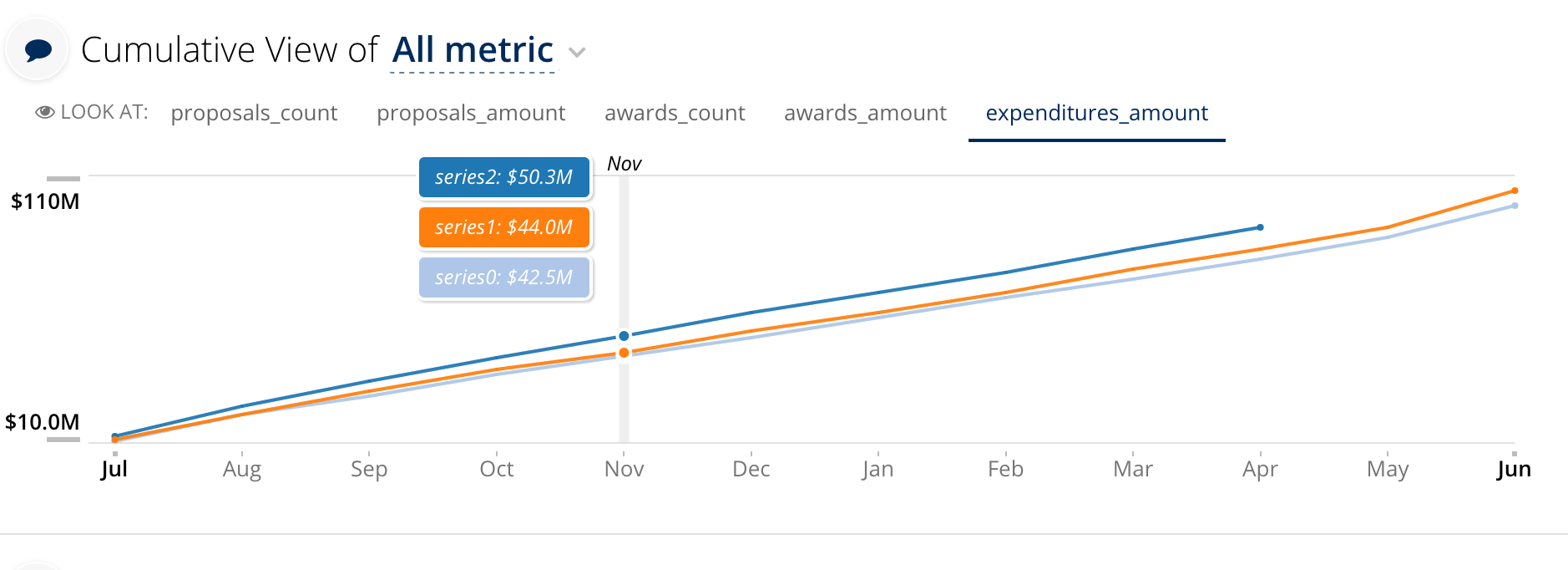
title: "Cumulative View of Dollar Amount""
config:
"canToggleDatasets": false
"datasets":
"dollar_amountTrend":
"series":
- "color": "#FF7F0E"
"name": "series0"
"negative": false
- "color": "#39E472"
"name": "series1"
"negative": false
- "color": "#1F77B4"
"name": "series2"
"negative": false
"showLegend": false
"type": "line"
"yRange":
- 0
- null
"showLegend": false
"type": "line"
"yRange":
- 0
- null
"selectionPolicy": "none"
"tooltipTemplateName": "#trend-slice-tooltip-row-template"
"legendTemplateName": "#trend-slice-dynamic-legend-template"
"type": "line"
"xAxisLabelPolicy": 12
"xField": "month"
data_service: "someService.TrendServiceCumulative"
Any additional dimensions and metrics are not included in the output in anyway.
ranged
The ranged flavor renders a single metric across a single
time dimension. Any additional metrics or dimensions are not used. A
dictionary can be supplied with as configuration via the render_config
keyword argument. It has a date_column key that has the ingredient name to
use as the date for the trend line, a include_missing_dates which is a
boolean that indicates if dates missing data should be included. By default
if include_missing_dates is true, the value is set to 0. You can also
pass missing_value, and set that as the value that you want to be used
if there is no value in the database. This is often supplied as None
to get it to include a gap in the data.
The code for the ranged Trend flavor looks as follows:
render_config = {'date_column': 'month',
                 'include_missing_dates': True,
                 'missing_value': None}

self.filters = [Filter(Audit.audit_name == self.selected_audit_name), Filter('month' is not None), ]
self.dimensions = ['month', ]
self.order_by = 'month'

recipe = self.recipe().metrics(self.metric) \
    .dimensions(*self.dimensions).filters(*self.filters).order_by(self.order_by)

self.response['responses'].append(
    recipe.render(self.metric + 'Trend',
                  flavor='ranged',
                  render_config=render_config)
)
And the slice in stack.yaml:
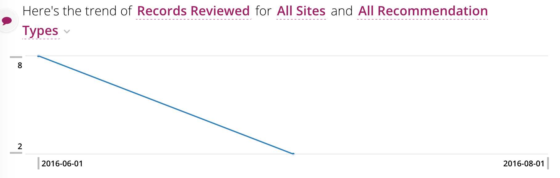
- slice_type: "trend"
  slug: "trend"
  title: "Here's the trend of <%= optionChooser1.selectionDisplay() %> for <%= rankedList1.selectionDisplay() %> and <%= rankedList2.selectionDisplay() %>"
  config:
    "dateParseFormat": "%Y-%m-%d"
    "selectionPolicy": "none"
    "type": "line"
    "xAxisLabelPolicy": "edges"
    "xField": "date"
  data_service: "someService.TrendServiceRanged"
Any additional dimensions and metrics are not included in the output in anyway.