Option Chooser
Warning
This help isn’t complete. It may even look terrible. If you want to work on it, see How to Contribute. You can also ask for help in the Juice Slack #documentation channel.
Contents
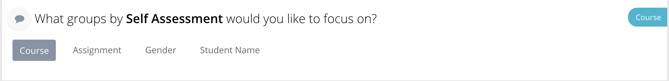
An Option Chooser slice is used to present the user with some data that can be used to select options to limit and filter the data in slices below. It comes in two main types: dropdown and horizontal list.
Option chooser config
Option chooser slices support the Common configuration options for all slices. Additional options are:
containerExtraClass
The class name that would be added to the options container
| Optional: | Yes. |
|---|---|
| Values: | CSS class name |
| Example: | config:
containerExtraClass: my-custom-option-container
|
groups (option chooser)
Overrides default option settings for specified chooser
| Optional: | Yes. |
|---|---|
| Values: | An object with option name as a key and {minSelections,maxSelections} properties |
| Example: | config:
groups:
"course":
minSelections: 1
"patient":
minSelections: 0
maxSelections: 4
|
hasFilterText
Should the slice display its local filter text (selection). Typically, this slice does not display filter text, so it is disabled by default. You need to explicitly enable it to display filter/selection text
| Optional: | Yes, default is ‘’false’’ |
|---|---|
| Values: | true|false |
| Example: | config:
hasFilterText: true
|
optionTemplate
Deprecated Use optionTemplateName instead! The template that would be
used
to render options
| Optional: | Yes, default is <div data-id=”<%= id %>” class=”group-container__item”><%= label %></div> |
|---|---|
| Values: | “*” |
optionTemplateName
The name of the template for the options.
NOTE This option is ignored when the option chooser is setup with the drop down mixin.
| Optional: | Yes, will use the default template (see OptionChooserSliceView.js) |
|---|---|
| Values: | CSS selector |
| Example: | config:
optionTemplateName: #my-custom-option-template
|
templateField
Name of the field in data item that refers to the template defined in template.html. Useful if data items should render different templates
| Optional: | Yes |
|---|---|
| Values: | String |
| Example: | config:
templateField: "templateName"
|
selectorTemplate
Deprecated Use selectorTemplateName instead! The template that would be
used to render options container/selector
| Optional: | Yes, default is <div data-name=”<%= name %>” class=”group-container__item-container”></div> |
|---|---|
| Values: | “*” |
selectorTemplateName
The name of the template for the container/selector.
NOTE This option is ignored when the option chooser is setup with the drop down mixin.
| Optional: | Yes, will use the default template (see OptionChooserSliceView.js) |
|---|---|
| Values: | CSS selector |
| Example: | config:
selectorTemplateName: #my-custom-selector-template"
|
showTitles
Should the selection names be visible right in front of the selection options?
| Optional: | Yes, default is |
|---|---|
| Values: | true|false |
| Example: | config:
showTitles: false
|
nonSelectedText
The text displayed when no option is selected
| Optional: | Yes, default is |
|---|---|
| Values: | String |
| Example: | config:
nonSelectedText: "Please select something"
|
Flavors for Option Chooser
Default (option chooser)
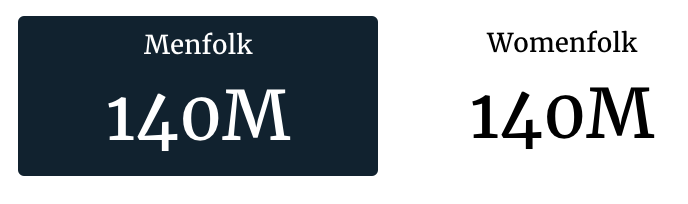
The default flavor renders on the distinct elements of a single dimension, and shows the value of a single metric for that dimension.
The code for the default OptionChooser flavor looks as follows:
self.metrics = ('pop2000', )
self.dimensions = ('sex',)
recipe = self.recipe().metrics(*self.metrics).dimensions(
    *self.dimensions)
self.response['responses'].append(recipe.render())
And the slice in stack.yaml:
- slice_type: "option-chooser"
  slug: "bar"
  title: "This could stay here"
  config:
    "optionExtraClass": "option-item-fixed-width"
    "optionTemplate": |-
            <div data-id="<%= datum.id %>" class="group-container__item"><div class="group-container__item__label"><%= datum.label%></div><div class="group-container__item__value"><%= datum.format('value', undefined, 'id') %></div></div>
    "showTitles": false
    "minSelections": 1
    "maxSelections": 1
  data_service: "censusv2service.FirstChooserV3Service"
Any additional dimensions and metrics are not included in the output in anyway.
dropdown
The dropdown flavor is used to create a drop down selection dialog.
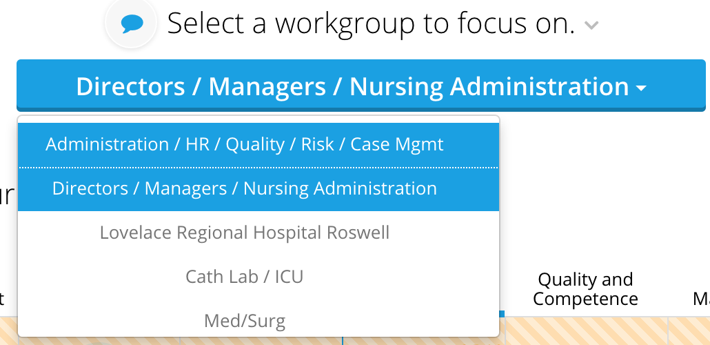
Building a dropdown requires the use of a single dimension in the recipe. This
example use the unit dimension to build a list of units to choose from:
self.dimensions = ['unit']
recipe = self.recipe().metrics().dimensions(*self.dimensions)
self.response['responses'].append(recipe.render('OptionChooser2',
                                                flavor='dropdown'))
And the slice in stack.yaml:
- slice_type: "option-chooser"
  slug: "option-chooser2"
  title: "Select a workgroup to focus on."
  style:
  - "section-content"
  config:
      "minSelections": 1
      "maxSelections": 1
  mixins:
  - "options":
      "optionsRange":
          - 1
          - 10000
    "target": "view"
    "class": "OptionChooserWithDropdownViewMixin"
  data_service: "EIDataServices.OptionChooser2Service"
Any additional dimensions and metrics are not included in the output in anyway.
metric
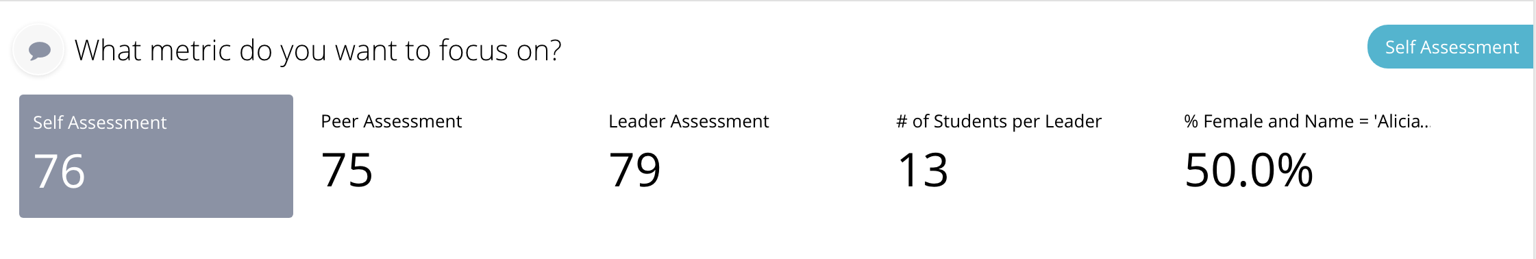
The metric flavor is used to create a horizontal list without using any dimensions, and shows a summary rollup for each metric.
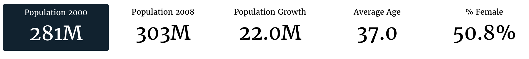
The metric flavor takes a collection of metrics, and no dimensions to build the response.
self.metrics = ('pop2000', 'pop2008', 'popdiff', 'avgage', 'pctfemale')
recipe = self.recipe().metrics(*self.metrics)
self.response['responses'].append(recipe.render(flavor='metric'))
And the slice in stack.yaml:
- slice_type: "option-chooser"
  slug: "bar"
  title: "This could stay here"
  config:
    "optionExtraClass": "option-item-fixed-width"
    "optionTemplate": |-
            <div data-id="<%= datum.id %>" class="group-container__item"><div class="group-container__item__label"><%= datum.label%></div><div class="group-container__item__value"><%= datum.format('value', undefined, 'id') %></div></div>
    "showTitles": false
    "minSelections": 1
    "maxSelections": 1
  data_service: "censusv2service.FirstChooserV3Service"
The flavor also automatically sets up the slice to use a core template to render the metrics if a custom template hasn’t been setup. The template renders the metrics like this:
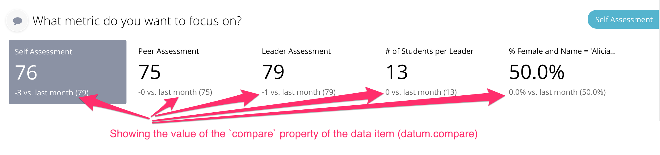
metric_compare
The metric_compare flavor is used to create a horizontal list without using any
dimensions, and shows a summary rollup for each metric and an optional
compare metric that comes a .compare() recipe.
The metric flavor takes a collection of metrics, and no dimensions to build the response.
self.metrics = ('pop2000', 'pop2008', 'popdiff', 'avgage', 'pctfemale')

# Create a comparison recipe that doesn't apply user filters
# This is often used to generate benchmarks
compare_recipe = self.recipe().metrics(*self.metrics)\
  .apply_user_filters(False)
recipe = self.recipe().metrics(*self.metrics).compare(compare_recipe)
self.response['responses'].append(recipe.render(flavor='metric_compare'))
And the slice in stack.yaml:
- slice_type: "option-chooser"
  slug: "bar"
  title: "This could stay here"
  config:
    "optionExtraClass": "option-item-fixed-width"
    "optionTemplate": |-
            <div data-id="<%= datum.id %>" class="group-container__item">
            <div class="group-container__item__label">
            <%= datum.label%></div>
            <div class="group-container__item__value">
            <%= datum.format('value', undefined, 'id') %>
            (benchmark <%= datum.format('compare', undefined, 'id') %>)
            </div>
            </div>
    "showTitles": false
    "minSelections": 1
    "maxSelections": 1
  data_service: "censusv2service.FirstChooserV3Service"
The flavor also automatically sets up the slice to use a core template to render the metrics if a custom template hasn’t been setup. The template renders the metrics like this:
buttons
The button flavor is used to create an array of buttons dialog.
Building buttons requires you to create an OptionChooserRenderer and supply it with a render_config containing the buttons you want as key, values in a dictionary with an optional path key to specify the path as shown here:
render_config = {
     'grouping_metric': 'pct',
     'grouping_ranges': [
        {'under 0.5': 0.5},
        {'0.5 - 0.6': 0.6},
        {'0.6 - 0.7': 0.7},
        {'0.7 - 0.8': 0.8}
     ]
     'buttons': [
         {'total': 'total_label',
          'path': 'path1'},
         {'standard': 'standard_label',
          'path': 'path2'},
         {'vent_trach': 'Vent/Trach',
          'path': 'path3'}
     ],
     'group_by': 'exclusion'
 }

 renderer = OptionChooserRenderer(self, None, 'button_name')
 response = renderer.render(flavor='buttons',
                            render_config=render_config)
 self.response['responses'].append(response)
NOTE: You must import OptionChooserRenderer:
from dataservices.renderers import OptionChooserRenderer
And the slice in stack.yaml:
- slice_type: "option-chooser"
  slug: "option-chooser2"
  title: "Select a button to focus on."
  style:
  - "section-content"
  config:
      "minSelections": 1
      "maxSelections": 1
  mixins:
  - "options":
      "optionsRange":
          - 1
          - 10000
    "target": "view"
    "class": "OptionChooserWithMultiselectViewMixin"
  data_service: "EIDataServices.OptionChooser2Service"
The flavor also automatically sets up the slice to use a core template to render the buttons if a custom template hasn’t been setup. The template renders the metrics like this: